Table of Contents
November Iteration
GNU social v3's backend and frontend development is currently taking place. The default interface serves as the groundwork for future user experience endeavors but also, to develop all the necessary tools needed to make plugin development possible in a timely manner.
Twig templates
The Twig template engine is used, making it possible to create reusable interface components. In general, templates take the shape of either whole pages, or small widgets. The latter being used extensively on the former.
If a template page is used, the directory should be named after the page itself under:
/templates
On the other hand, widgets should be placed followed by the corresponding name under
/templates/cards/
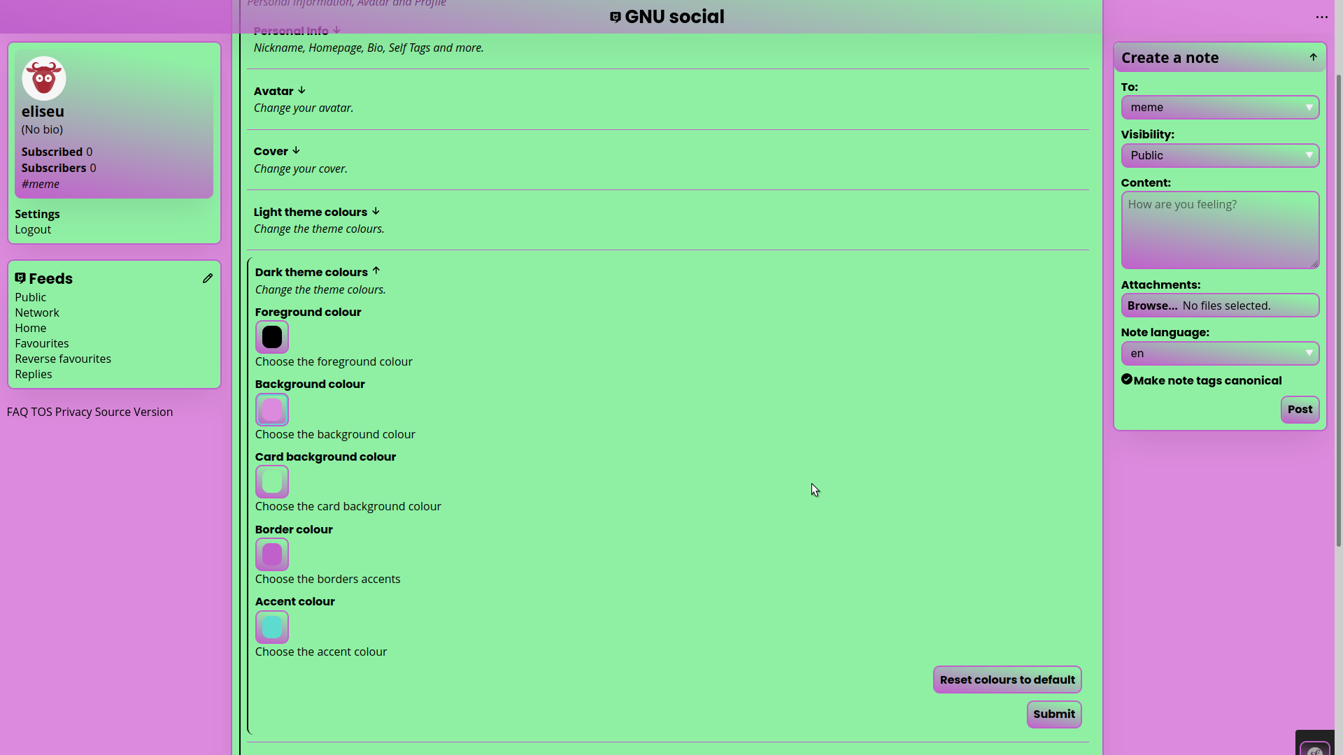
User system theme is followed by default, however there are plugins available to change the theme colours as desired, see this section for more information.
Page structure
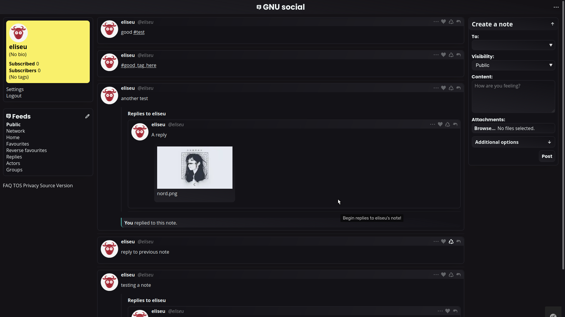
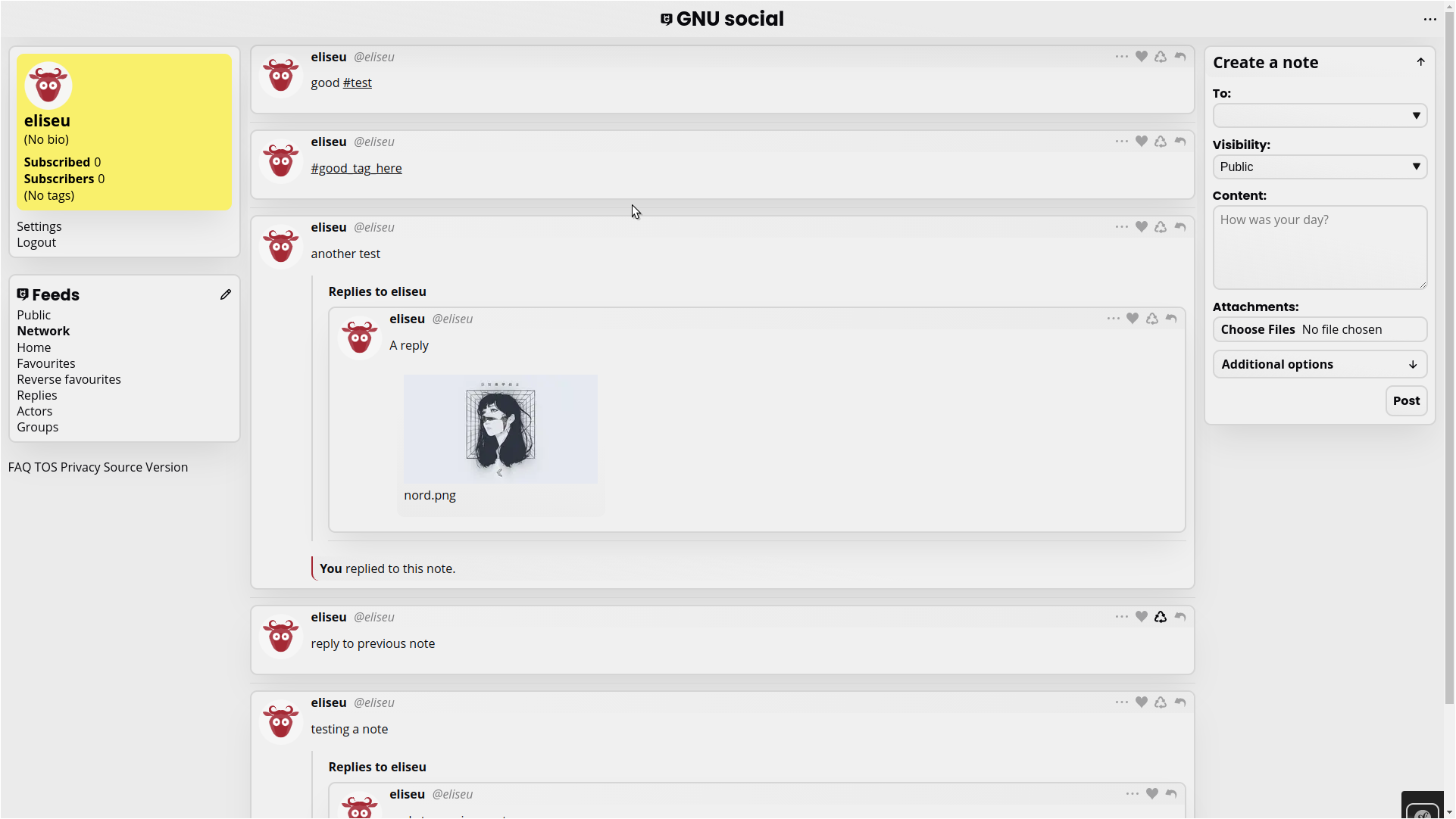
The page is formed by three regions, each one containing their own components/widgets. Plugins may be added through events in a myriad of specific locales within these regions. If the plugin requires it's own widget to be presented, the context and importance need to be considered when choosing the desired locale.
The standard page grid regions are:
- left panel
- active page
- right panel
Assuming a LTR layout, the left panel is the first area our eyes are drawn upon, and therefore it provides profile information and the main navigation tab. Placement within this region should only be considered if the context allows and/or is of high importance within the given page.
The active page region, as the name implies, is used by the current route page template. Nonetheless, it is here that most context specific placement opportunities will take place. If a feed is currently active, the respective Note widgets are placed, which provide various ways to append plugin widgets, for example.
Finally, the right panel serves as an area for any plugin that isn't highly specific on context/use or that isn't primordial to the user experience basic functionality.
Bear in mind that in the following images, the user profile section colours are user defined through the ProfileColour plugin.
Dark default theme
Light default theme
User panel
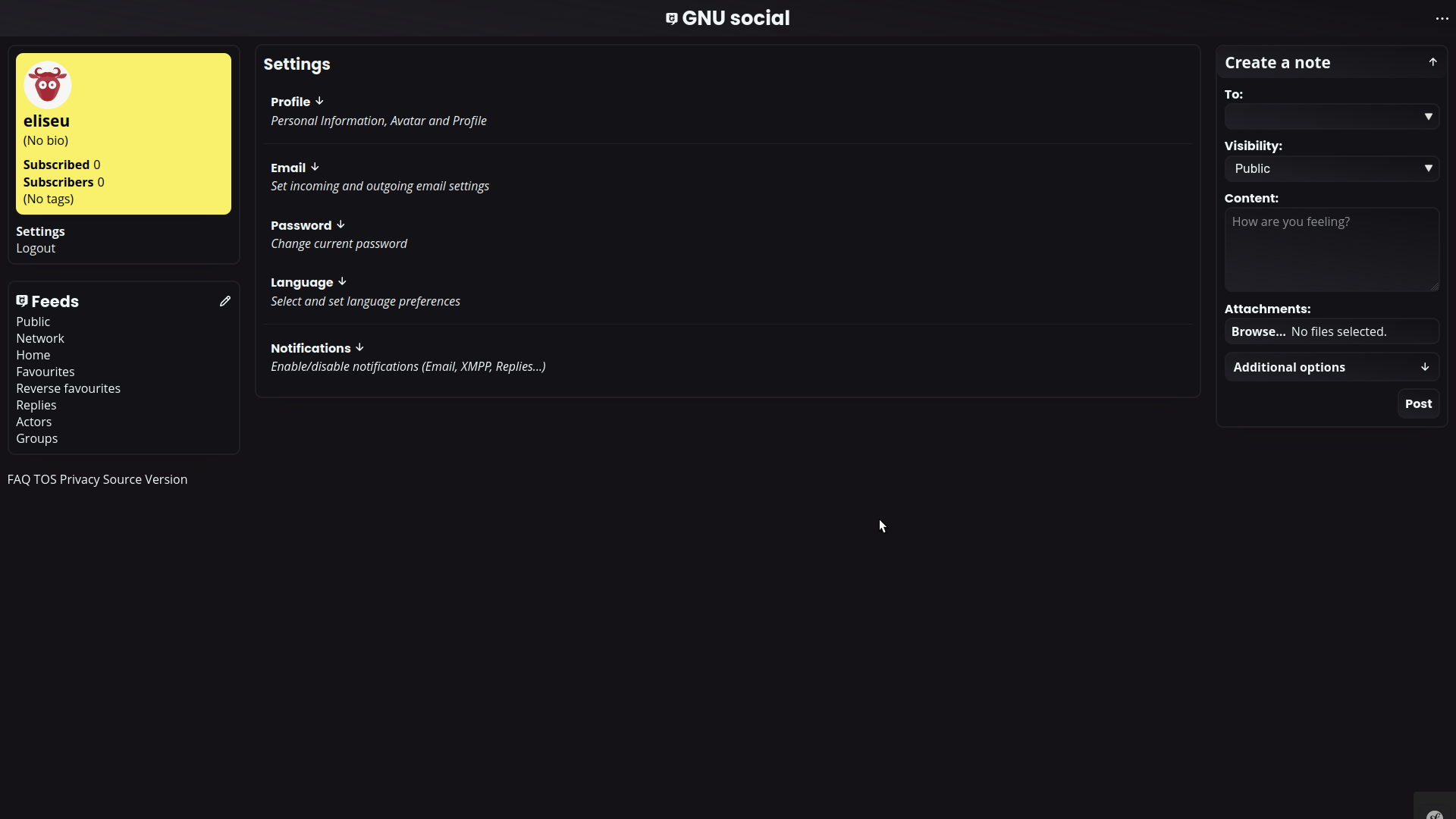
Various user panel organisational improvements were done, more specific categorisation being a big part of it. Additionally, plugins can be placed within each category if it desires.
An example of the three-like hierarchy possible:
- Profile
- Personal Info
- Nickname
- Fullname
- Homepage
- Bio
- …
- Avatar
- Profile colour (plugin)
- Light and Dark theme colours (plugin)
- Email
- Password
- Language
- Notifications
- Email
- Xmpp
- …
Dark default theme
Language
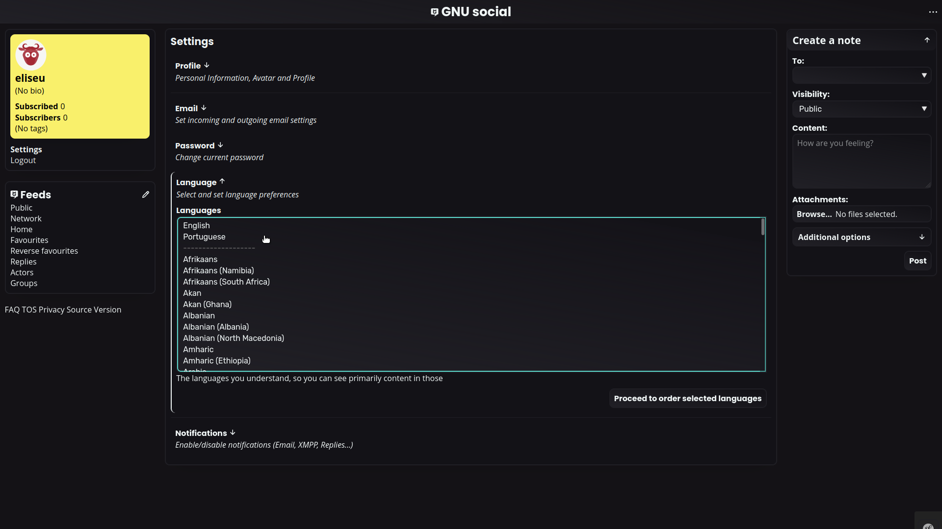
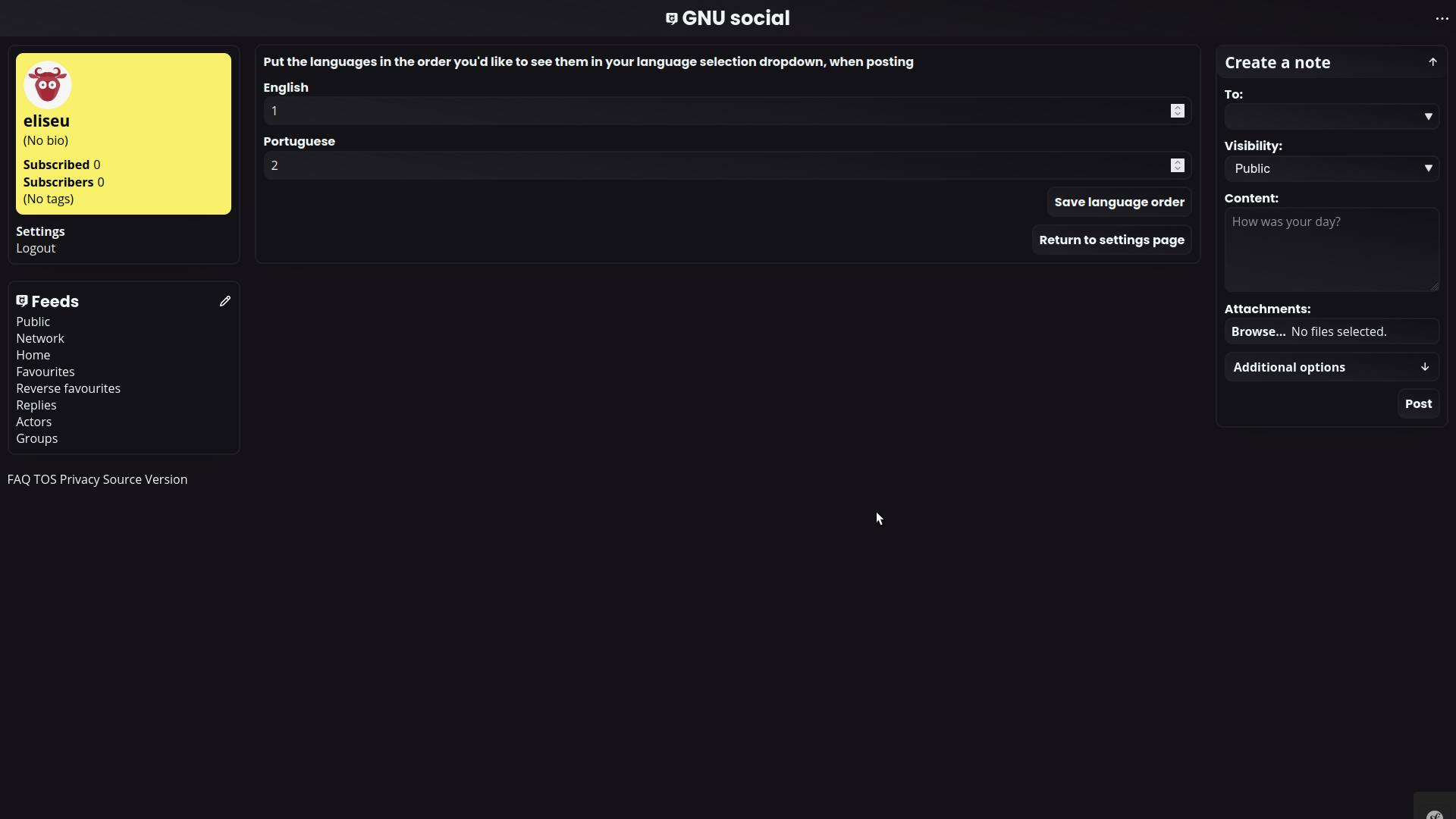
The user is able to define preferred languages, by default the highest priority language set will be used as a lang HTML attribute when posting a new note. As implied, the user is able to order languages preferred.
When posting a note, the language option will be available under the Additional options details element. By providing this information, within the HTML markup itself, screen readers performance should improve.
Language settings page
The user panel section provides a multiple select box, after the language preference selection the user is redirected to order them.
Plugins
Oomox
Theme colour customisation is made possible through the Oomox plugin, the corresponding user panel profile settings section is added with the help of a PopulateProfileSettingsTabs event.

